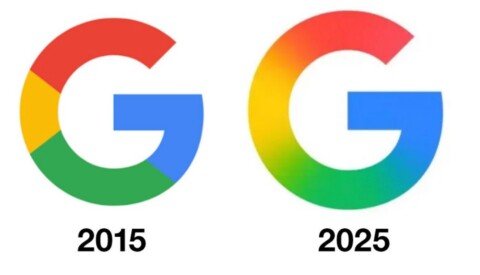
Par CritikMagmai 16, 20250 Comments Google modernise son logo “G” après 10 ans de stabilité Google retouche son logo “G” avec un dégradé fluide inspiré de Gemini, marquant un tournant